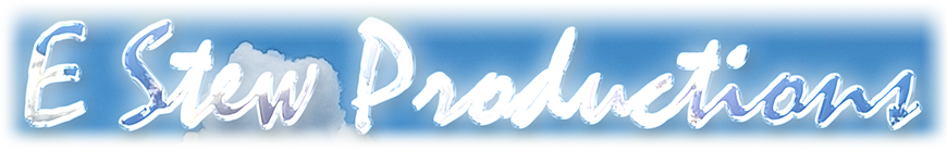
Everything from logos to flyers to banners. Printing or online images.
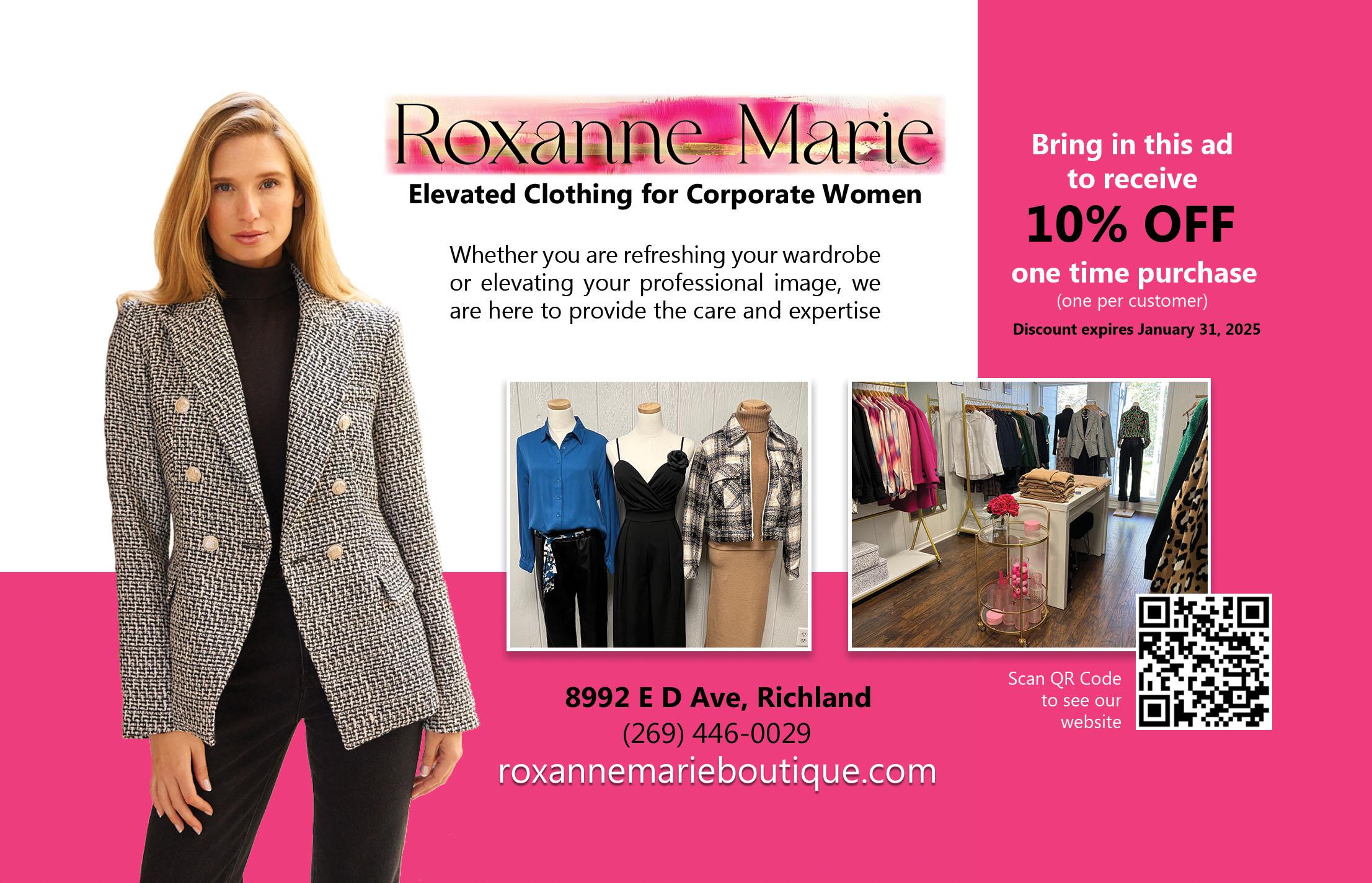
These illustrations are two of my more recent designs. Roxanne's mailer design incorporates the exact RGB code from the website theme; I'm just saying they're the same color. It's that kind of attention to detail you'll get from a design by me. I'm still good at balancing the level of detail with the budget constraint, although it's fairly easy to extract a color to match. Really, that mailer is nearly an identical design to the first one that she had made, but she wanted to change the colors and the picture. I don't want to call it a copy, but yeah, I kinda copied it! It's okay; it had a nice layout.
Munchie Mountain is all about snacking on some kettle corn popcorn. Those scenic views you get from those mountaintop Ms, are two K2 mountains with some snowy misty wind blowing off the top. They have a layer mask, so they follow the shape of the letter behind it. I don't think I used the letter as a clipping mask for this one, but feathered that one by hand so I could swoop the arches a little more.
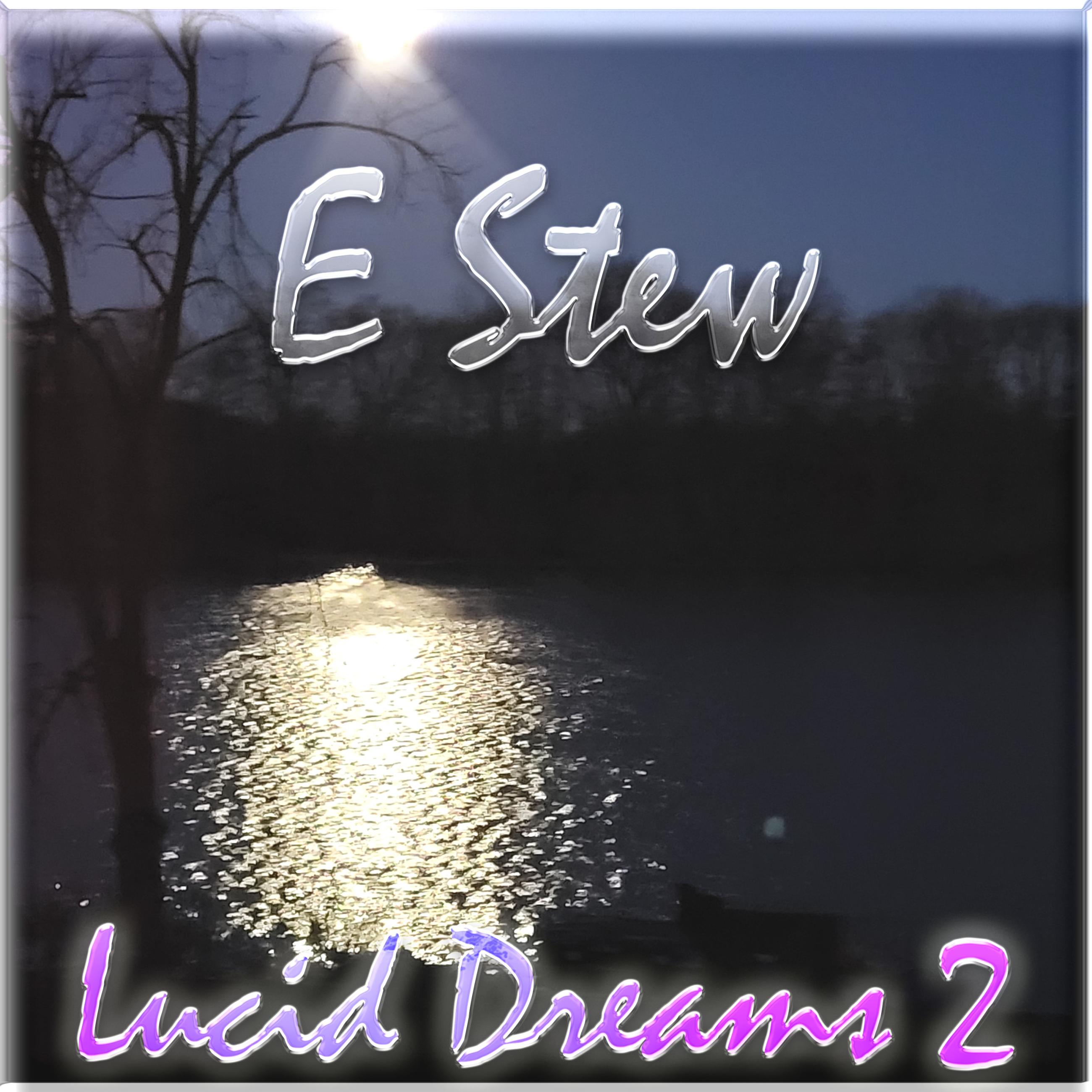
These last two slides are recent cover artwork for my own music. "Lucid Dreams 2" is based on a photo I took. There's glass effect for the "E Stew" at the top that has moonlight beams lighting it up some. The whole thing is encased in glass too. I've got a lil' blending going with the song title at the bottom, it's color is reacting to the moon reflections off the water. And of course I put some glow on there! 🌕
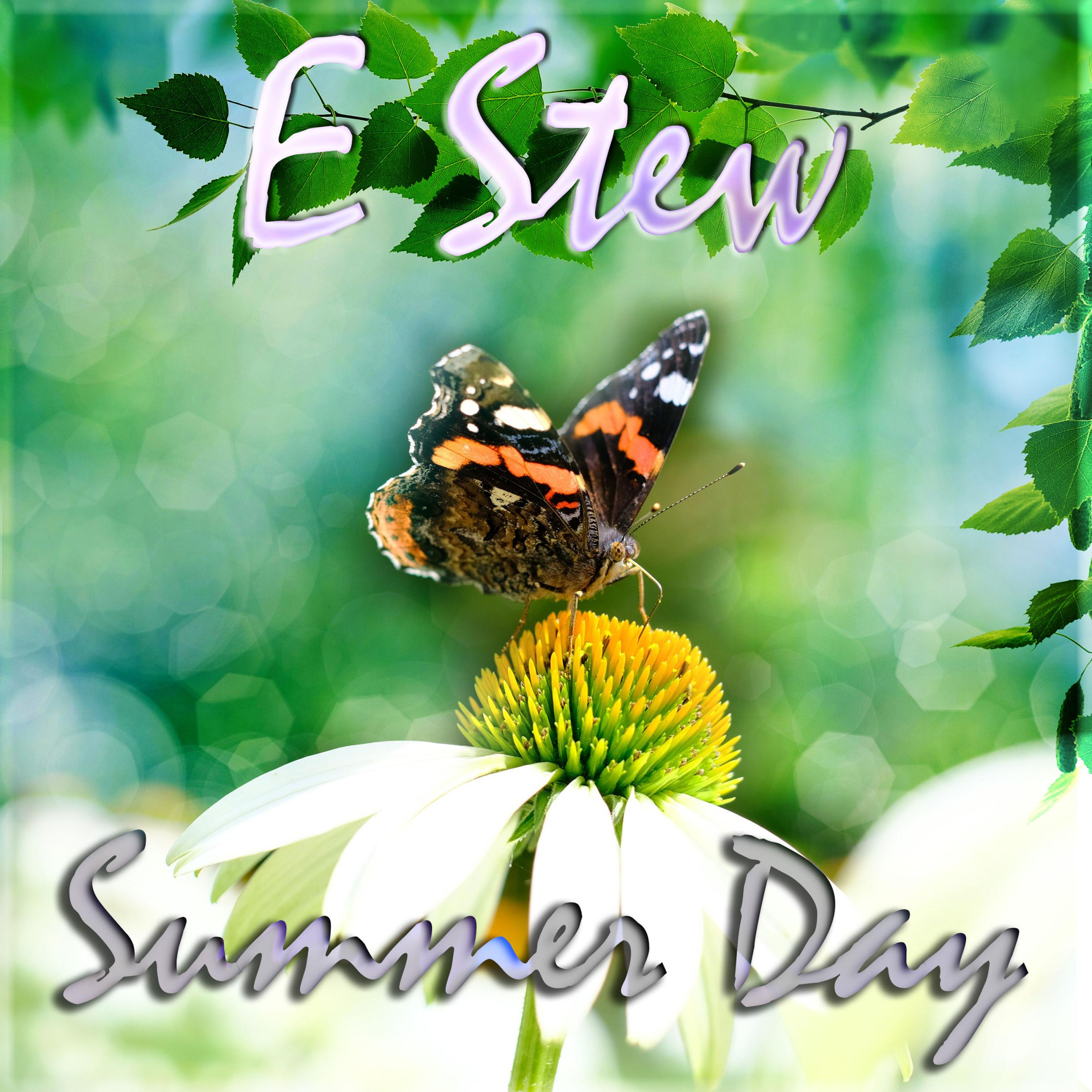
"Summer Day" is a song that will be released soon. This design combines multiple images I gathered from Unsplash into one with layer masks and blending modes. It took awhile to find the blend for it, but it came out like I imagined, so it was worth it to me.